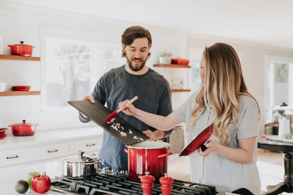
Kitchen Cabinet Colours That Stand the Test of Time
Kitchen cabinets are a decade-long commitment. Here are the colours that designers and homeowners consistently do not regret.
Kitchen cabinets are a decade-long commitment. Here are the colours that designers and homeowners consistently do not regret.
Kitchen cabinets are not like cushions or curtains. You cannot change them on a whim. The colour you choose today is a colour you will likely live with for ten years or more — through different furniture, different trends, different phases of your life.
This makes the decision genuinely important. And yet most people make it in a way that is more reactive than considered: they see a kitchen they like on Instagram, they match the colour, and they hope for the best.
Here is a more considered approach — and the specific colours that consistently perform well over time.
Why Trends Are a Trap in Kitchen Design
The problem with choosing a kitchen colour based on what is popular right now is that kitchen renovations are expensive enough that you cannot easily redo them when the trend moves on. The bold cobalt blue cabinets that felt fresh and exciting in 2021 may feel considerably less exciting in 2028.
This is not an argument against colour. It is an argument for choosing colours that have a certain timelessness to them — colours that draw on enduring palettes rather than momentary fashion.
White and Off-White: The Reliable Foundation
White cabinets are the default choice for good reason. They are bright, they make a kitchen feel clean, they work with virtually any countertop material, and they age well. The key is to choose the right white.
Pure bright white can feel cold and clinical, particularly in kitchens with limited natural light. Off-white tones — warm whites with cream, yellow, or pink undertones — are significantly more livable. Shaker-style cabinets in a warm off-white with brass or aged nickel hardware is a combination that has been popular for decades and shows no sign of becoming dated.
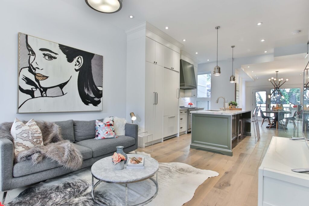
Sage Green: The Contemporary Classic
Sage green has become one of the most significant kitchen colours of the past decade. What makes it work is its desaturation — it is neither bold enough to feel like a statement nor neutral enough to feel like a non-choice. It sits in a comfortable middle ground that reads as considered without being demanding.
Sage works particularly well with natural stone countertops, warm wood open shelving, and brass fixtures. It suits both period properties and contemporary ones. And crucially, it has the quality that distinguishes lasting colours from trending ones: it looks better as the kitchen around it ages, rather than worse.
Deep Navy and Midnight Blue: The Bold Choice That Lasts
Deep blues have a long history in kitchen design that predates any current trend. Navy kitchen cabinetry, particularly on lower units with lighter upper cabinets or open shelving, has a quality of richness and depth that is hard to achieve with any other colour.
The combination of deep navy lower cabinets with warm white upper cabinets and a marble or quartz countertop is a classic that continues to be reproduced for the simple reason that it works. The dark lower cabinets recede visually, making the room feel taller. The light uppers keep the space bright. The contrast between them is inherently satisfying.
Warm Charcoal and Slate: Sophisticated and Unexpected
Warm grey-charcoal is perhaps the most underused colour in kitchen design. It lacks the clarity of navy and the friendliness of sage, which makes it feel more challenging. But in a kitchen with good natural light and warm complementary tones, a charcoal or slate cabinet colour has an extraordinary quality of sophistication.
The warmth in the undertone is critical. A cold blue-grey will feel dull and institutional. A warm grey with brown or green undertones — what paint manufacturers might call a warm slate or a warm graphite — feels grounded and genuinely beautiful.
The Colour to Avoid
The honest answer is that almost any colour can work in the right kitchen with the right complementary choices. The colours most likely to disappoint over time are those chosen purely because of a trend moment: very specific shades that are heavily associated with a particular year or aesthetic movement. These colours have a particular quality of feeling dated once the trend moves on, in a way that more considered colour choices simply do not.
Before You Decide
Paint large samples on your actual cabinet doors and live with them for several days. Look at them in morning light, midday light, evening light, and artificial light. Colours behave very differently under different conditions, and a colour that looks beautiful in a showroom may look completely different in your specific kitchen.
Take the time to look properly. A kitchen that you still love in ten years is worth the patience it takes to get the colour right.