Neutral palettes are the most misunderstood category in interior design. People assume they mean beige. They mean something far more considered: a curated range of tones that share an underlying warmth or coolness, layered in texture and material rather than colour, creating rooms that feel complete without relying on contrast or bold statement.
The world great interiors — the ones that feel genuinely beautiful in person, not just in photographs — are more often built on neutral foundations than on bold ones. Here is how to understand and apply a neutral palette properly.
What Neutral Actually Means
A neutral colour is not a colourless one. White has undertones — pink, yellow, green, blue. Greige sits somewhere between grey and beige, and can lean warm or cool depending on the light. Cream, mushroom, stone, chalk, alabaster, parchment — these are all neutrals, and they are all different.
The critical principle is undertone consistency. A room where the white walls have pink undertones, the sofa is in a greige with green undertones, and the rug is in a cream with yellow undertones will feel subtly wrong without anyone being able to identify why. The colours are all neutral. They simply do not belong to the same family.
Choose your neutrals from the same temperature family. Warm neutrals — those with yellow, orange, or pink undertones — belong together. Cool neutrals — those with blue, green, or grey undertones — belong together. Mixing the two creates a room that feels unresolved.
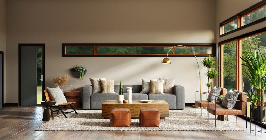
The Role of Texture
In a neutral room, texture does the work that colour does elsewhere. Without variation in surface quality — matte and glossy, rough and smooth, woven and solid — a neutral palette becomes flat and uninteresting. With it, the room has depth, richness, and a quality of visual complexity that reads as intentional rather than cautious.
Consider how different materials handle light differently. A matte plaster wall absorbs light softly. A linen sofa scatters it. A polished stone surface reflects it sharply. These differences in reflectivity create movement in a room throughout the day, making it feel alive even when nothing in it is particularly bold.
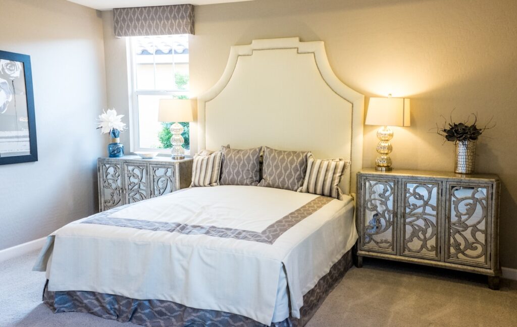
The Anchor Piece
Every neutral room needs at least one element that grounds it — what designers sometimes call an anchor. This might be a dark-stained wood floor, a stone fireplace surround, a single piece of furniture in a deeper tone, or a collection of objects in bronze or brass.
The anchor prevents a neutral room from floating — from feeling like it has no weight or substance. It provides a reference point for the eye, something to return to after moving around the space. Without it, neutral rooms tend to feel unfinished, regardless of how carefully the rest has been executed.
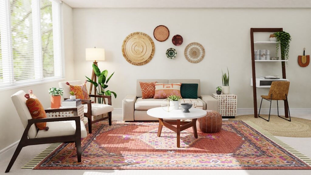
Bringing in Colour
A neutral palette does not mean no colour. It means that colour, when it appears, is deliberate and carries more weight precisely because the room around it is restrained. A single burnt orange cushion in a room of warm cream and stone reads as a considered choice. The same cushion in a room full of competing colours disappears.
The rule is simple: in a neutral room, every colour you introduce should earn its place. If you cannot articulate why it is there, it probably should not be.