2025 Interior Colour Trends: The Earth Tones Redefining Luxury Homes
From raw umber dining rooms to sage-washed bedrooms — a muted, mineral palette is rewriting the rules of refined living.
From raw umber dining rooms to sage-washed bedrooms — a muted, mineral palette is rewriting the rules of refined living.
Something profound is happening to the walls of the world’s most admired homes. The stark whites and clinical greys that dominated the last decade are quietly being displaced — not by bold maximalism, but by something far more considered. A warm, mineral palette drawn from soil, stone, and bark is emerging as the new language of refined interiors, and designers from Milan to Mumbai are speaking it fluently.
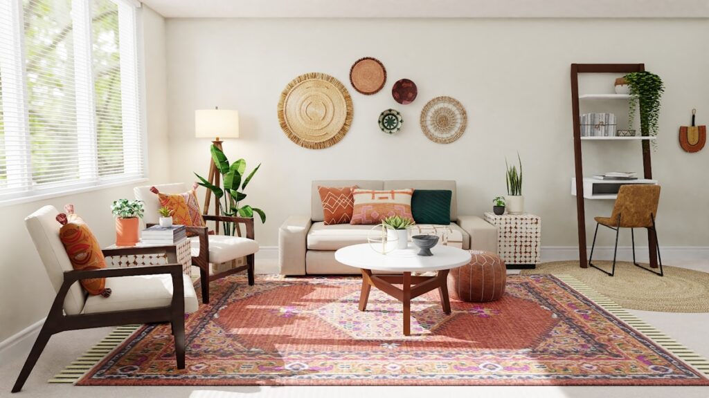
Earth tones are no longer the preserve of rustic farmhouses or bohemian studios. In 2025, raw umber dining rooms, terracotta hallways, and sage-washed bedrooms are appearing in some of the most prestigious architectural projects globally. This is luxury redefined through restraint — and it is breathtaking.
Why Earth Tones Are Redefining Luxury in 2025
The shift toward earth-toned interiors is not a trend born of whim. It reflects a deeper cultural recalibration — a collective desire for spaces that feel grounding, authentic, and genuinely liveable. After years of performative minimalism, homeowners are craving warmth, texture, and a sense of organic permanence.
Interior psychologists point to a post-pandemic reassessment of the home as sanctuary. When the world outside feels uncertain, we instinctively reach for colours rooted in nature — hues that evoke stability, depth, and the quiet comfort of the natural world. Earth tones deliver precisely this emotional resonance.
From an aesthetic standpoint, these colours also offer extraordinary versatility. They sit beautifully in both contemporary and traditional settings, age gracefully with materials like linen, marble, and aged brass, and create the kind of layered, timeless interiors that never feel dated.
The Key Colours Defining the Palette
Terracotta — The Heartbeat of the Movement
No colour better captures the essence of 2025’s interior mood than terracotta. Ranging from dusty coral to deep clay, this sun-baked hue brings an immediate sense of warmth and Mediterranean soul to any room. When used on plaster walls with a matte finish, terracotta creates a depth that changes beautifully throughout the day as natural light moves across it. Pair it with aged brass hardware, hand-thrown ceramics, and undyed linen for a look that is effortlessly sophisticated.
Raw Umber — The New Neutral
Raw umber has quietly dethroned greige as the neutral of choice for discerning designers. Sitting at the intersection of brown, khaki, and olive, it is a deeply complex colour that reads differently depending on the light and the materials around it. In north-facing rooms it takes on a moody, almost tobacco quality; in south-facing spaces it glows with warmth. Raw umber works particularly well in libraries, home offices, and dining rooms where a sense of gravitas is desired.
Sage Green — Calm Made Visible
Sage green occupies a unique position in the earth tone palette — it carries the grounding quality of nature while introducing a note of botanical freshness. It is the colour of old olive trees, dried herbs, and weathered shutters on a Provencal farmhouse. In 2025, sage is being used extensively in bedrooms and bathrooms, where its inherently calming properties support rest and restoration. It pairs beautifully with warm whites, pale wood, and unlacquered brass.
Chalky White — The Essential Counterpoint
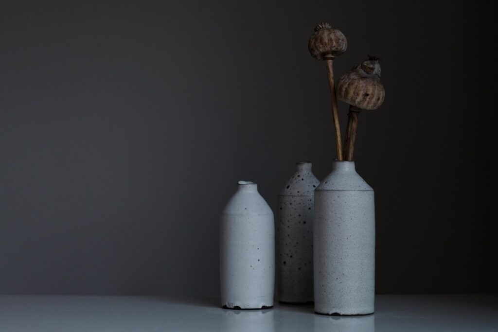
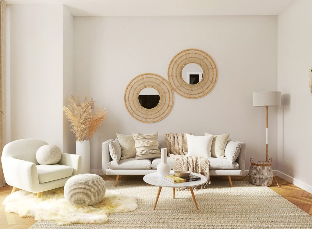
No earth tone scheme is complete without a chalky white to provide relief and light. Unlike the cold, bluish whites of previous decades, the whites favoured in 2025 have a warmth and softness that comes from underlying yellow or pink undertones. Think lime-washed plaster, aged linen, and sun-bleached stone. These whites allow earth tones to breathe, preventing a scheme from feeling heavy or cave-like, and they create the luminous quality that distinguishes a great room from a merely good one.
Room-by-Room Guide to Earth Tone Interiors
Living Rooms
The living room is where earth tones truly come into their own. Consider a raw umber or deep terracotta on the walls, anchored by a stone or concrete floor and softened with a large, undyed wool rug. Furniture in natural linen or aged leather adds tactile richness. The key is layering — multiple textures in the same tonal family create depth and visual interest without introducing jarring contrast.
Bedrooms
For bedrooms, the gentler end of the earth tone spectrum is most effective. Sage green, warm taupe, or a soft clay will create the cocoon-like quality that promotes genuine rest. Keep the palette tightly edited — two or three tones at most — and invest in quality bedlinen in natural fibres. A single piece of raw ceramic or a branch of dried botanicals on the bedside table completes the picture with elegant restraint.
Kitchens
The kitchen is perhaps the most exciting canvas for earth tones in 2025. Cabinetry in deep olive, warm mushroom, or raw umber pairs magnificently with unlacquered brass fittings and natural stone worktops. These colours age gracefully, developing a beautiful patina over time that mass-produced kitchens can never replicate. For smaller kitchens, a chalky white upper cabinet with an earth-toned lower is a balanced and practical approach.
Bathrooms
Bathrooms benefit enormously from the spa-like quality of earth tones. Textured plaster in warm putty or sage, combined with natural stone tiles and simple wooden accessories, creates a bathing environment that feels genuinely restorative. Avoid glossy finishes in favour of matte or honed surfaces, which absorb light gently and enhance the organic mood.
How to Style Earth Tones Like a Designer
The secret to a successful earth tone interior lies in understanding tone and texture rather than simply colour. Here are the principles that separate exceptional schemes from merely pleasant ones.
Commit to a dominant hue. Choose one earth tone as your anchor and build around it. Trying to use too many simultaneously creates visual noise rather than harmony.
Introduce contrast through texture, not colour. Instead of adding contrasting colours to break up an earth tone scheme, vary the surfaces — rough plaster against smooth stone, nubby linen against polished wood.
Use light thoughtfully. Earth tones are transformed by warm, directional light. Invest in table lamps and wall lights with warm-toned bulbs rather than relying on overhead lighting alone.
Bring in living elements. Plants, dried botanicals, and natural objects anchor an earth tone scheme in the organic world it references. A large-leafed plant in a terracotta pot is an almost infallible styling choice.
Edit ruthlessly. Earth tone interiors are about considered abundance, not accumulation. Every object should earn its place. The negative space between objects is as important as the objects themselves.
The Lasting Appeal of Earth
What makes the current embrace of earth tones feel genuinely significant is its depth. This is not a seasonal colour story that will be replaced by next year’s trend report. It reflects something more fundamental: a reorientation of what we consider beautiful, valuable, and worth living with.
The homes that will be celebrated and photographed a decade from now are the ones being designed today in raw umber, terracotta, and sage. They are warm, considered, deeply human spaces — and they are, without question, the future of luxury interior design.