The Living Room Colour Combinations That Interior Designers Actually Use
Colour is the fastest way to transform a living room, and the most misunderstood. Here is how designers actually think about it.
Colour is the fastest way to transform a living room, and the most misunderstood. Here is how designers actually think about it.
Ask most people what colour they want their living room and they will say something safe. Greige. Warm white. Classic navy. These are fine choices. They are also the choices of someone who is slightly afraid of colour — and honestly, that is understandable.
Colour is the element of interior design that carries the most risk and the most reward. Get it right and the room feels completely alive. Get it wrong and every day you spend in it feels slightly off, like a picture hung at a slight angle that you never quite straighten.
Here is how designers actually think about colour — and the combinations that keep appearing in rooms that genuinely work.
Start With the Feeling, Not the Colour
Before you look at paint chips, ask what you want the room to feel like. Not look like — feel like. Calm and restorative? Sociable and energising? Warm and enveloping? Crisp and clear?
These feelings map to colour families in ways that are surprisingly consistent. Warm mid-tones — terracotta, aged ochre, dusty sage — tend to feel grounding and comfortable. Cool tones — slate blue, sage green, dusty lavender — feel quieter, more considered. Neutral palettes with strong contrast feel structured and confident.
Define the feeling first. The colour will follow more naturally.
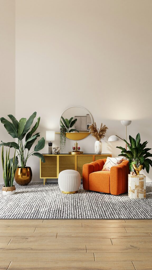
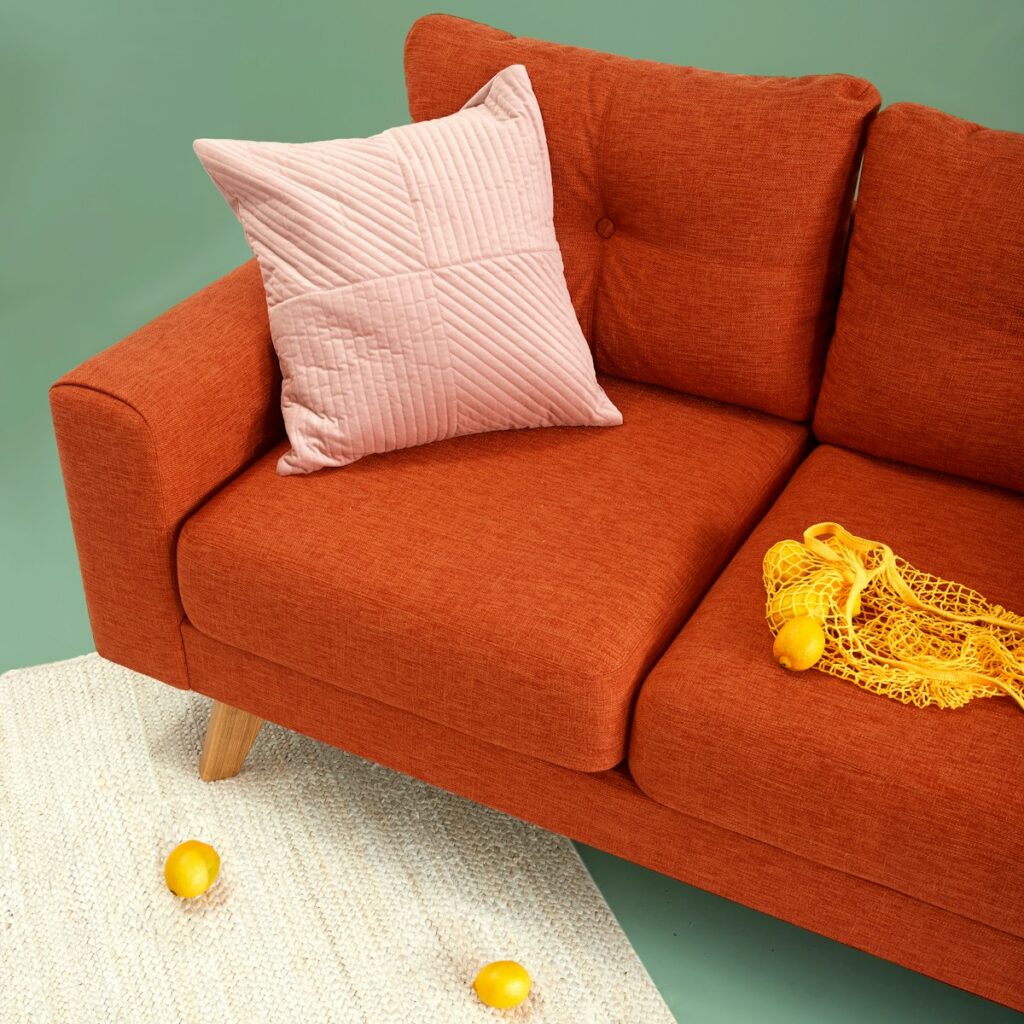
Combination 1: Warm Cream and Terracotta
This is one of the most enduring colour pairings in residential design. A warm cream on the walls — not cold white, but something with yellow or pink undertones — paired with terracotta in the furnishings creates a room that feels genuinely warm without being heavy.
The key is to vary the depth of the terracotta. A rich burnt sienna in a throw, a dustier clay in the cushions, a pale blush in the rug. This tonal variation within the same colour family gives the room depth without visual noise.
Combination 2: Deep Green and Natural Linen
Forest green walls have had a sustained moment in interior design, and with good reason. Deep green has an unusual quality: it is dramatic enough to feel considered but natural enough to feel genuinely livable. Paired with natural linen in cream or warm oat tones, it creates a room that feels both rich and relaxed.
Brass hardware, warm wood tones, and ceramic objects in natural glazes all sit beautifully against deep green. This palette works particularly well in rooms with good natural light, where the green shifts and deepens through the day.
Combination 3: Navy, Warm White, and Natural Wood
This is the combination that designers return to when clients say they want something timeless. Navy walls or a navy sofa paired with warm white walls, natural oak or walnut furniture, and accents in aged brass or matte black creates a room with genuine staying power.
The warmth of the wood prevents the navy from feeling cold or corporate. The white keeps the room from becoming too dark. The brass adds a note of luxury without ostentation. It is a palette of careful contrasts.
Combination 4: Soft Sage and Dusty Pink
If you want a room that feels current without being trend-dependent, soft sage paired with dusty pink is a reliable choice. Both colours sit in the desaturated middle ground — neither bold nor neutral — which means they complement each other without competing.
Use sage as the dominant tone in the walls or the largest piece of upholstery, and bring in dusty pink through cushions, lampshades, or a single statement chair. Ground both colours with warm neutrals and natural materials.
Combination 5: Moody Warm Neutral With High-Contrast Accents
This is the sophisticated version of the all-neutral room. A warm mid-tone like tobacco, mink, or mushroom covers the walls and large surfaces. Then one or two elements in a strong, deliberate contrast — deep black, rich chocolate, or a single burst of amber — stop the room from dissolving into beige.
It is a palette that rewards confidence. The accents have to be genuine choices, not afterthoughts. Done well, it creates a room that feels like it belongs to an adult.
The Colour Rule Worth Keeping
Whatever combination you choose, there is one principle that consistently separates rooms that work from rooms that almost work: repeat each colour at least three times. A single terracotta cushion looks like an accident. Three terracotta elements — a cushion, a vase, a candle — look like a decision.
Repetition is what turns individual choices into a palette. It is the difference between a room that has been decorated and a room that has been designed.
Choose your colours deliberately. Repeat them consistently. And do not be afraid of them.